C Ruby Rose Hover
Test
I conducted moderated usability testing with a prototype. All participants were able to complete the tasks successfully. Feedback helped refine icon placement, spacing, and copy for clarity. The Multiple Alerts feature tested positively, especially for users managing work, personal, and family responsibilities.
User Tasks Included
1. Discover the Marketplace
Navigate from Calendar homepage to App Marketplace.
Success = Finds it without search; understands purpose.
2. Install an app from calendar’s app store/marketplace (e.g., Zoom)
Select and install an app from the marketplace.
Success = Completes install and grants permissions without confusion.
3. Add multiple alerts to an event
Create an event and add more than 2 alerts/reminders
Success = Seamlessly finds and selects the add alert icon
Initially, I designed 4 default options to “add an alert.” Based on feedback and hesitations from users when completing the alert task in the usability test, I designed more space between “add alert” and “invitee” options to differentiate the two. I also chose to change the copy “invitee” to the verb “Invite” to match the other action words on the page.

Conclusion
This project strengthened my ability to move from research through concept definition and testing with intention. I grew more confident in estimating timelines, iterating through blocks, and relying on user feedback to guide decisions.
Key takeaways included the importance of designing for real workflows rather than forcing new ones. If extended, I would continue testing marketplace structure and developer feasibility, and broaden testing.

Usability Testing revealed hesitation when adding alerts, and feedback suggested spacing, and icon updates.
Iterations based on usability test results:

Design
I began with low fidelity wireframes before creating high-fidelity designs that align with Apple’s native UI. The Marketplace includes a dedicated icon inside Apple Calendar for efficient access and to remind users of potential collaborations for their calendar. In the App Store, users can filter for apps that integrate with Apple Calendar.
For alerts, I added the ability to stack a custom amount of reminders within the event creation flow to support users who need multiple or layered time cues. I iterated on layout, labeling, and navigation to support clarity and good usability.
Conclusion
The redesigned experience now:
• Guides users clearly into programs and key information
• Builds trust through authentic content and structure
• Supports donors in understanding impact and taking action
• Helps parents and educators register with clarity and ease
• Works responsively across devices
Most importantly, the site now supports the mission rather than getting in the way of it. The design creates space for human connection, learning, and access to nature to remain at the center.
Next Case Study
View Prototype
Results
All participants successfully completed the assigned tasks. They described the site as warm, intuitive, and welcoming. However, one consistent hesitation appeared around the hamburger icon on mobile. Users preferred when the menu was clearly labeled, instead
Iterations Based on Fe:
• Added a visible “Menu” label beside the hamburger icon
• Increased the tap-target size for accessibility and ease
• Simplified the tone and visual styling of the mobile menu
• Prioritized “Programs” as a key navigation item and call to action
The goal throughout testing was not simply aesthetics. It was building user confidence and removing uncertainty, particularly for educators, parents, and donors who were already investing emotional and logistical energy in supporting students.of assuming they would recognize the icon on its own.

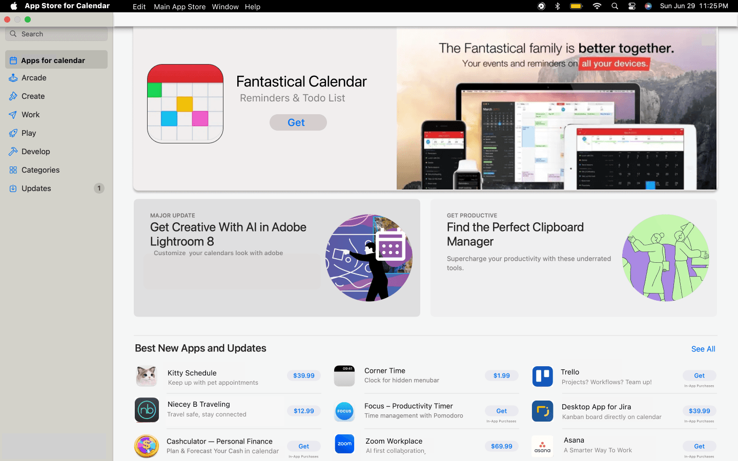
The final design includes a filter for apps that work directly with Apple Calendar, helping users quickly find compatible tools that improve scheduling and productivity. Early research showed that users wanted meaningful integrations, not just more apps, and a calendar filter in the app store creates a streamlined approach to find worthwhile productivity tools.
Lastly, I designed the option to add multiple reminders/alerts to calendar events based on user
research suggesting forgotten appointments, and missed reminders. This also serves neurodivergent users with time blindness who may need less predictable reminder intervals.
This is apple’s calendar with a dedicated app store with access directly from the calendar.


Low FIdelity Wireframes:
High Fidelity Mock-ups:
Define
I synthesized research into themes and mapped the user journey to identify friction points around scheduling and integrations. I created task flows for discovering, installing, and using apps inside Apple Calendar, as well as adding and managing multiple alerts for events.
Key needs identified:
• Users want to extend Apple Calendar rather than switch tools
• Integrations should be easy to find and install
• Alerts should support layered reminders for important tasks
These needs directly informed the Marketplace concept and the Multiple Alerts feature
Point of View
Users want to rely on Apple Calendar as their primary scheduling tool, but its limited customization options and lack of integrations force them to juggle multiple calendars, creating frustration from duplicated events, decision fatigue, and cognitive overload when coordinating across work and personal life.
How Might We...
Reduce the need for multiple calendar apps by enhancing Apple Calendar's flexibility and feature set?
Help users consolidate their digital scheduling into a single, seamless interface that handles both personal and professional needs?
Reduce calendar clutter by intelligently organizing and filtering events by context without duplicating data?
Empower users to control what information is synced and shared between different areas of their life?
User Persona:


Designing for both user goals, and business goals stayed a priority for me. I also understood the technical constraints of designing Apple features.
Most of the users interviewed are juggling multiple roles in their lives, and using a calendar is a way of life for them.
Research
I conducted qualitative user interviews to understand how people manage calendars, tools, and reminders. A key insight was that many users do not choose Apple Calendar as their primary tool, even when they use Apple devices. Users struggled to connect Apple Calendar with tools they already use, and several expressed the need for more control over reminders and scheduling customization. Participants wanted a calendar that fits into existing workflows rather than replacing them. They also wanted the ability to set multiple reminders so nothing slips through the cracks. Insights from a competitive analysis, user interviews, and synthesizing research in an affinity map, and User Personas guided me to the two core feature directions: improving integrations and improving alerts. From there, I designed low fidelity wireframes, and high-fidelity mock-ups, and prototypes before running usability tests.
Affinity Map


Competitve analysis:
Background
Many Apple users rely on competing calendar apps.
Problem
Apple calendar’s integrations & customizations are limited.
Project Goals
Reduce workflow friction
Improve customization
Support users who depend on third-party tools to manage schedules.
Project duration: 75 hour time limit
My Role: UX/UI Designer (research, synthesis, design,
testing, iteration)
Tools: Figma, Google Meet, Maze/remote moderated testing
Key Deliverables:
Research plan & user interviews
Affinity mapping & insights
Personas
Wireframes
High-fidelity mockups
Usability testing & iteration
Project Overview
Apple Calendar is a widely used native tool, but many users still rely on competing calendar apps because integrations and customization are limited. The goal of this project was to design an in-app Calendar Marketplace where users can discover and install tools that integrate directly with Apple Calendar, and to improve the alert experience by allowing users to set a custom amount of reminders per event.
I designed three core enhancements:
An Apple Calendar app marketplace that opens directly from within the calendar
A filter inside the App Store to show specific apps that integrate with Apple Calendar
The ability to add custom & multiple alerts to an event
