Redesigning a responsive website for an outdoor education non-profit
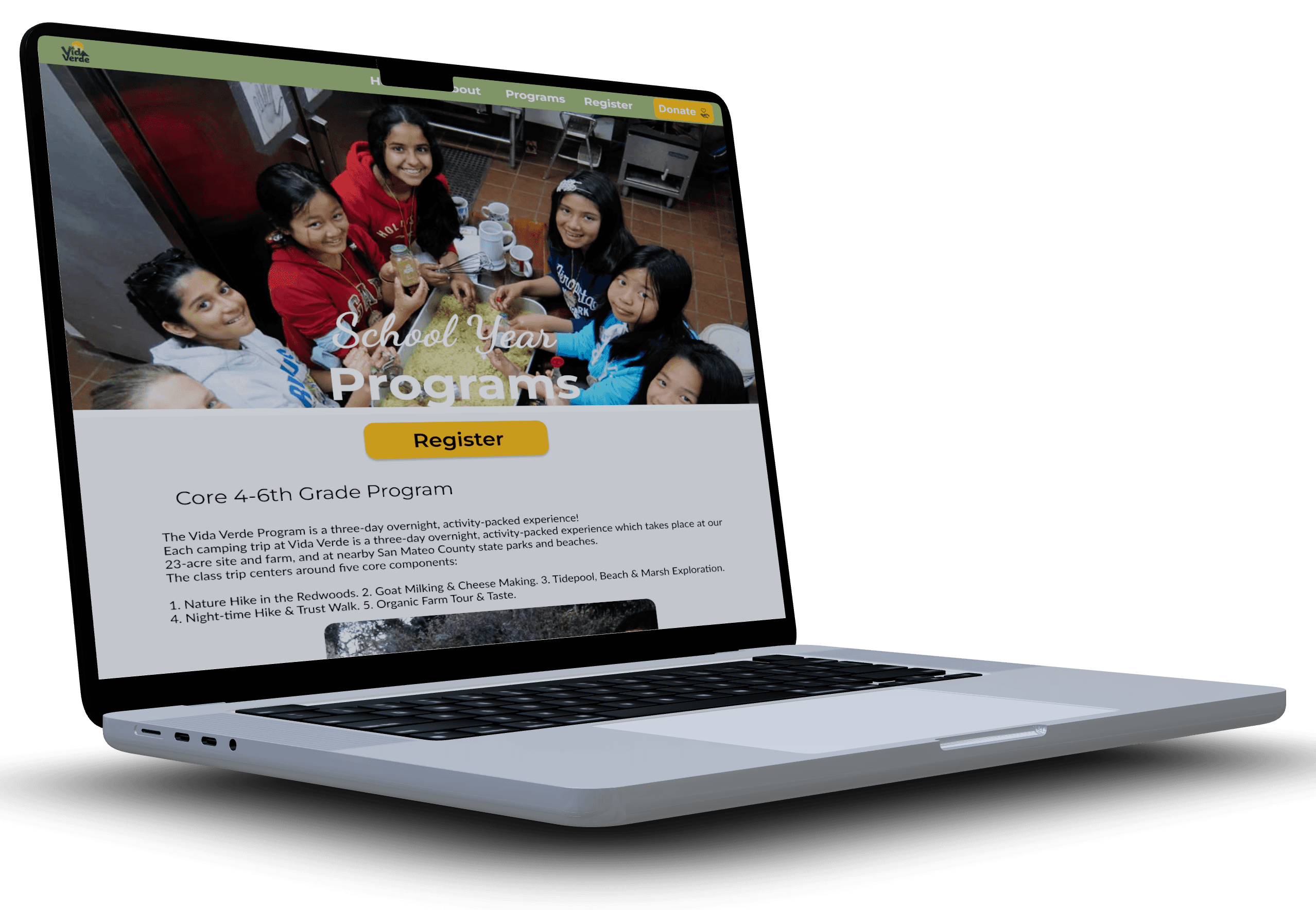
Vida Verde: Responsive Website Design
Project Overview
Vida Verde is an outdoor education nonprofit that believes every student deserves meaningful time in nature. Their programs bring joy, belonging, curiosity, and connection into learning.
Unfortunately, their website wasn’t supporting that mission as strongly as it could, and I was tasked with providing a website audit and redesign. Users struggled to understand:
What programs exist
Who they’re for
How to register
How to donate
It wasn’t a content problem. It was a clarity problem. The path to action required too much guessing.
Project duration: 65 hour time limit
My Role: UX/UI Designer (research, synthesis, design,
testing, iteration)
Tools: Figma, Google Docs, Maze/remote moderated testing
Key Deliverables:
User interviews
Affinity mapping & insights
Personas
User flows
Responsive wireframes
High-fidelity mockups
Usability testing & iteration
Problem
Vida Verde’s website doesn’t support their mission as strongly as it could due to usability concerns.
Background
Vida Verde’s mission is to provide FREE overnight environmental learning experiences for middle school & high school students.
Project Goals
Design a website that feels as welcoming and supportive as the programs themselves while making participation and donation effortless.
Research
I took an iterative approach. I validated design decisions with users feedback. I conducted five remote interviews with students, parents, volunteers, donors, and educators to understand how real people interact with nonprofit websites. In addition to asking what they clicked, I asked what they felt, and why.
What I Heard
“I just want to know what the program actually is and how it works.”
“If it looks too polished or stock-photo-y, it feels fake.”
“Make it really obvious where to register.”
Affinity Map:

Define
After synthesizing the research into an affinity map and personas, the core problem became clear:
Users wanted to register or donate, but the website didn’t make the path obvious or intuitive.
This limited participation and funding, which ultimately impacts student access to nature-based learning.
My design goals became:
Surface next-step action
Reduce cognitive friction
Build emotional trust
Support all device sizes
Keep the tone warm + human
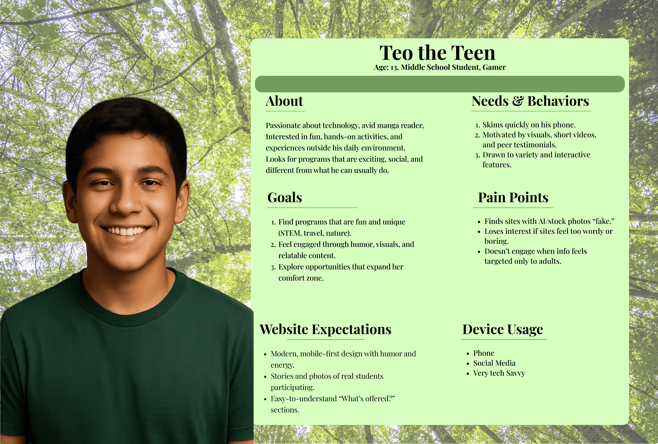
Persona: Teen/Participant
Point of View
Students & Parents
Teens need to see relatable stories and easy entry points, because while the programs are exciting, a confusing website leads to user abandonment and makes it hard for them to feel included.
Donors
Donors need visible and transparent giving opportunities because they are motivated by connection, but need clear, trustworthy pathways to translate that into support.
How Might We...
Make calls-to-action (register, donate, volunteer) more prominent & intuitive?
Simplify information architecture so users can find what they need in fewer clicks?
Highlight the human impact in ways that inspire users to donate or participate?
Surface authentic stories and visuals that bring the in-person connection online?
Registration user flow for Vida Verde Website Redesign
Low fidelity wireframe for Vida Verde’s desktop registration form.
Low fidelity wireframe for Vida Verde’s Desktop Homepage.
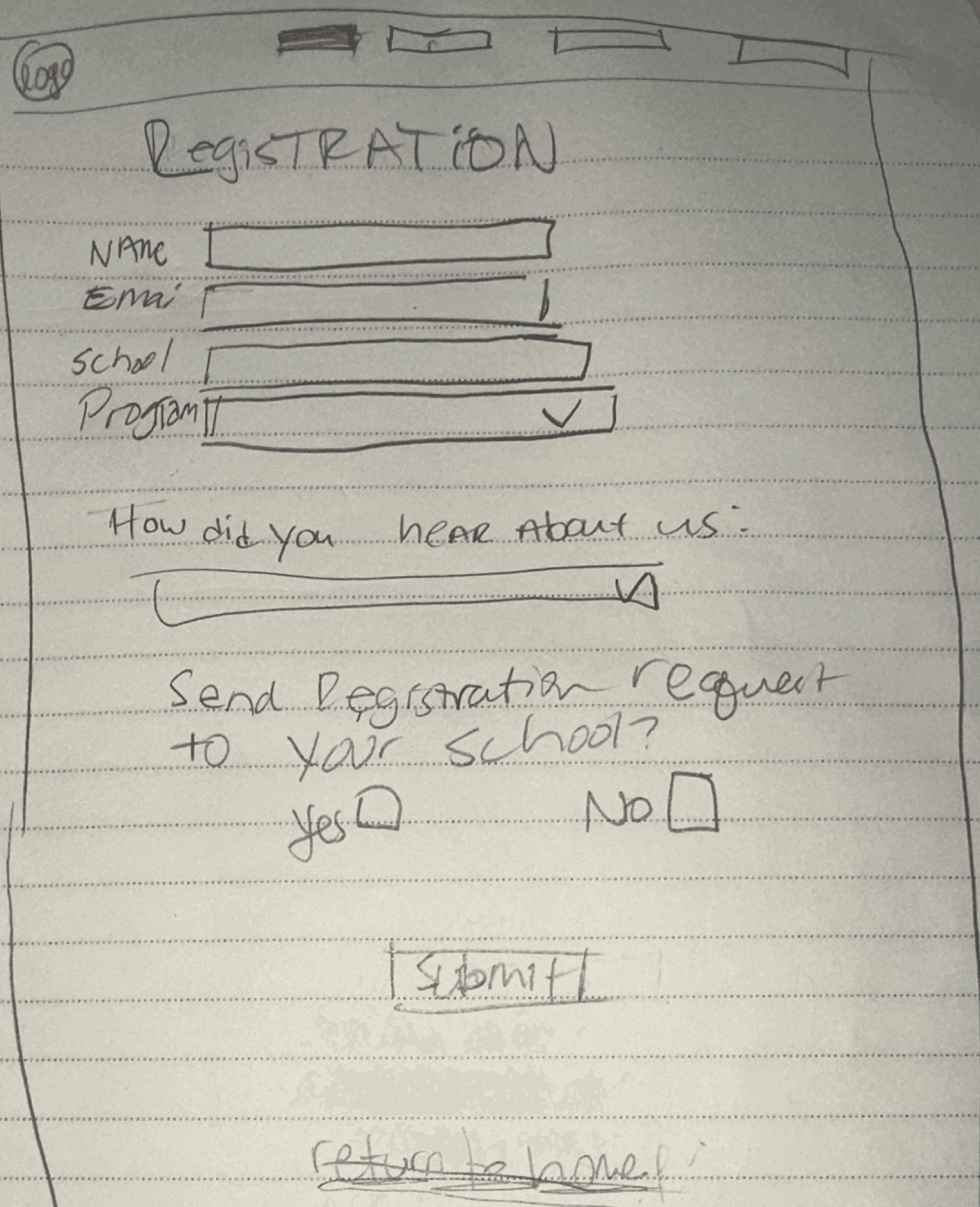

Low-fidelity Wireframes
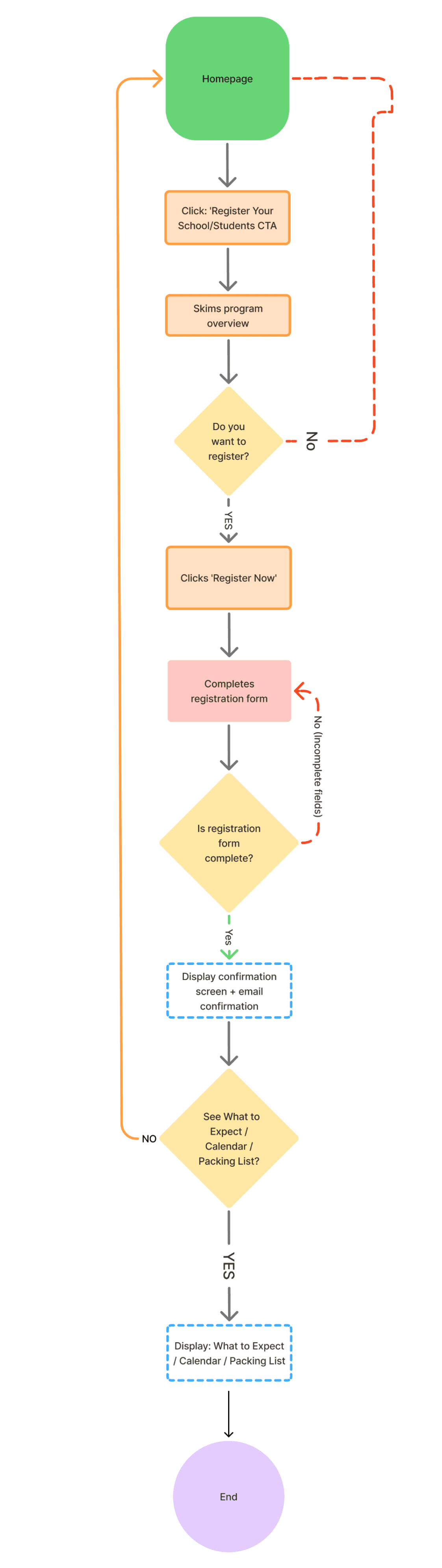

User Flows:
Design
I focused the redesign on information architecture and interaction design so users could easily understand programs, register, and donate with confidence.
During this redesign I:
• Built user flows around real user goals, including learning about programs, deciding, registering, and donating
• Used those flows to inform layout, hierarchy, and call-to-action placement
• Designed responsive low, mid, and high-fidelity wireframes and iterated based on usability test results
The visual direction reflects the heart of the organization. It is warm, natural, simple, and welcoming, without unnecessary complexity or corporate tone. The design supports the mission rather than competing with it.
The final experience is structured, human-centered, and shaped by real user needs.
The visual direction intentionally reflects the heart of the organization. I wanted it to feel warm, natural, welcoming, simple, and honest. The goal was to remove unnecessary friction and avoid anything that felt overly wordy or complicated to navigate. The website should not overshadow the mission. It should support it, clearly and thoughtfully.
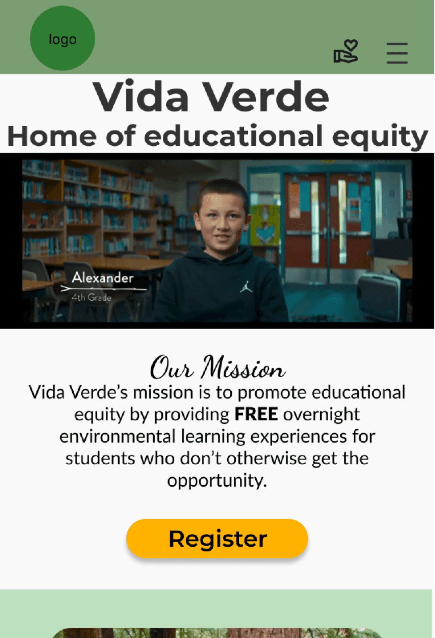
I chose to place a video in the hero section. Vida Verde has a beautifully shot emotionally strong video on their homepage, but it doesn’t auto-play, and there is no continuity with the remainder of their site, even making you navigate away from the video to access the homepage. By adding the video to the homepage it decrease site abandonment and prompts users to explore the site more.
With usability in mind, I catered to users of all ages. I made the program details in concise visual cards. I prioritized the register and donate buttons on every screen.


High-fidelity Responsive Mock-ups
Conclusion
The redesigned experience now:
• Guides users clearly into programs and key information
• Builds trust through authentic content and structure
• Supports donors in understanding impact and taking action
• Helps parents and educators register with clarity and ease
• Works responsively across devices
Most importantly, the site now supports the mission rather than getting in the way of it. The design creates space for human connection, learning, and access to nature to remain at the center.
Added more visuals, and used color blocks to break up the text and not overwhelm the use
Prioritized “Programs” as a key navigation item and call to action instead of “register” as the main CTA
Added a visible “Menu” label under the hamburger icon.
The goal throughout testing was building user confidence and removing uncertainty, particularly for educators, parents, and donors.
Iterations Based on test results:

Test
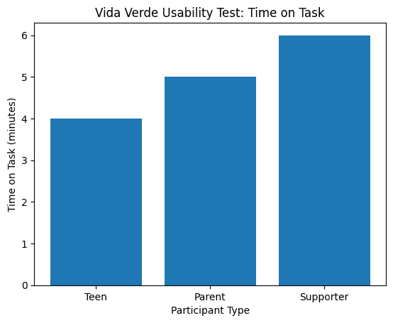
I tested the high-fidelity desktop and mobile prototypes with participants who aligned with my user personas. The goal was to understand whether users could clearly navigate the site, complete key actions, and feel confident while doing so.
User Tasks Included:
• Find a program
• Understand program details
• Begin the registration process
• Locate the donation pathway
https://www.figma.com/proto/9mdsT4sXkeCEqzspQNzo7L/Add-A-Feature--iCal-Ruby?node-id=4-11&p=f&t=AGMuD8QzEGEtRShF-1&scaling=scale-down&content-scaling=fixed&page-id=0%3A1&starting-point-node-id=4%3A11&show-proto-sidebar=1
C Ruby Rose Hover